Article Mashup
A pattern is a set of relationships, which can be realized using different materials and geometries.
Living architecture is highly dependent on patterns, which shape buildings and spaces accordingly. Balance is achieved by an overall coherence and lack of clutter. Symmetries are all cooperating to support each other, with nothing extraneous or distracting. One of the basic tenets of sustainability is that you do not consume more than can be replaced. We see this simplicity in nature, though it is never actually “simple” in the sense of being minimalist. There is an understanding that – alongside ever improving connections to external information resources – encouraging communication and knowledge sharing within individual companies increases the potential for more creative and experimental approaches to work.
Simplicity and inner calm. This is a more subtle quality. They are fully embracing changes which promote and stimulate creative work processes through communication, experimentation and new forms of collaboration.
GREEN
Nikos Salingaros. "A Theory of Architecture Part 2: The Adaptive Design Method" 30 Mar 2014. ArchDaily. Accessed 7 May 2015. <http://www.archdaily.com/?p=491122>
BLUE
Nikos Salingaros. "Unified Architectural Theory: Chapter 11" 02 May 2015. ArchDaily. Accessed 8 May 2015. http://www.archdaily.com/?p=626429
PINK
"Centre for Virtual Engineering / UNStudio" 24 Jun 2012. ArchDaily. Accessed 19 May 2015. <http://www.archdaily.com/?p=247077>
Perspectives
36 Custom Textures
Moving Elements
Image Captures and Architecture
This birds eye view from outside displays the façade with lack of clutter. I found that a
completely grounded building was confronting so I added a subtle ‘lift’ of the
geometry so that students will be more inclined to experience the minimalism by being able to adjust
within the space below, inside as well as above the building.
Instead
of having separate block buildings, I emphasized a supporting walkway system
which provides a coherent relationship between the main two masses. Here
materiality also subtly defines the movement from the interconnecting geometry
to the library.
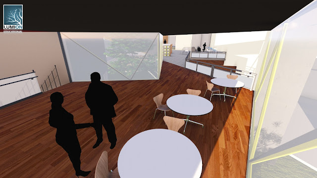
Here I have
captured the floor plan of the library involving a schematic use of differing
heights to serve different spatial functions. This promotes knowledge, open discussion and the ease of communication.
Another mechanism of understanding space in portrayed in the
unconventional floor plans where there is an emphasis on the vertical
connections rather than the horizontal planes. The wooden furnishings create a natural environment and assist in
fostering collaborative thought in sustainability.
This ground level view portrays a set of relationships
between the geometries and materiality of the building. It maps out the idea of
not consuming more than can be replaced in the way that there is circulation not
only within but also around and below the building.
Textures used in Model
Shifting
This
shifting texture is used for the moving platform as a transportation device for
people at ground level to access the social rooftop garden at the top of the
building. Participants will be able to scan their smart phones to initiate the
vertical movement of the platform.
Scalar
The
scalar texture is used for the bridging walkway in my building, representing
direction as well as movement of those
using it. It also emphasises the element's spatial
versatility; such as being able to circulate through it and below it.
Synchronised
Finally, the
synchronized texture was chosen for my partition walls in the studio to
maximise functionality of an open space. This idea allows a transition of space
for larger class sizes as well as for a more intimate studio space.
Last Lecture: Proof of Attendance
Lumion File Link
https://drive.google.com/folderview?id=0Bx7OaoKaNp-vfjg4MHFKWlZKaFJmSE5WYWRhSmlCUUNCemVXVVZJWVJqczRSODR5UnVuTU0&usp=sharing
Sketchup File Link
https://drive.google.com/folderview?id=0Bx7OaoKaNp-vflJyX0dEaWpGVGh6c09jVkdETFAtTUY3VDU4cXk4aXFYSHR5dmlESkRNMTg&usp=sharing


